Bitora
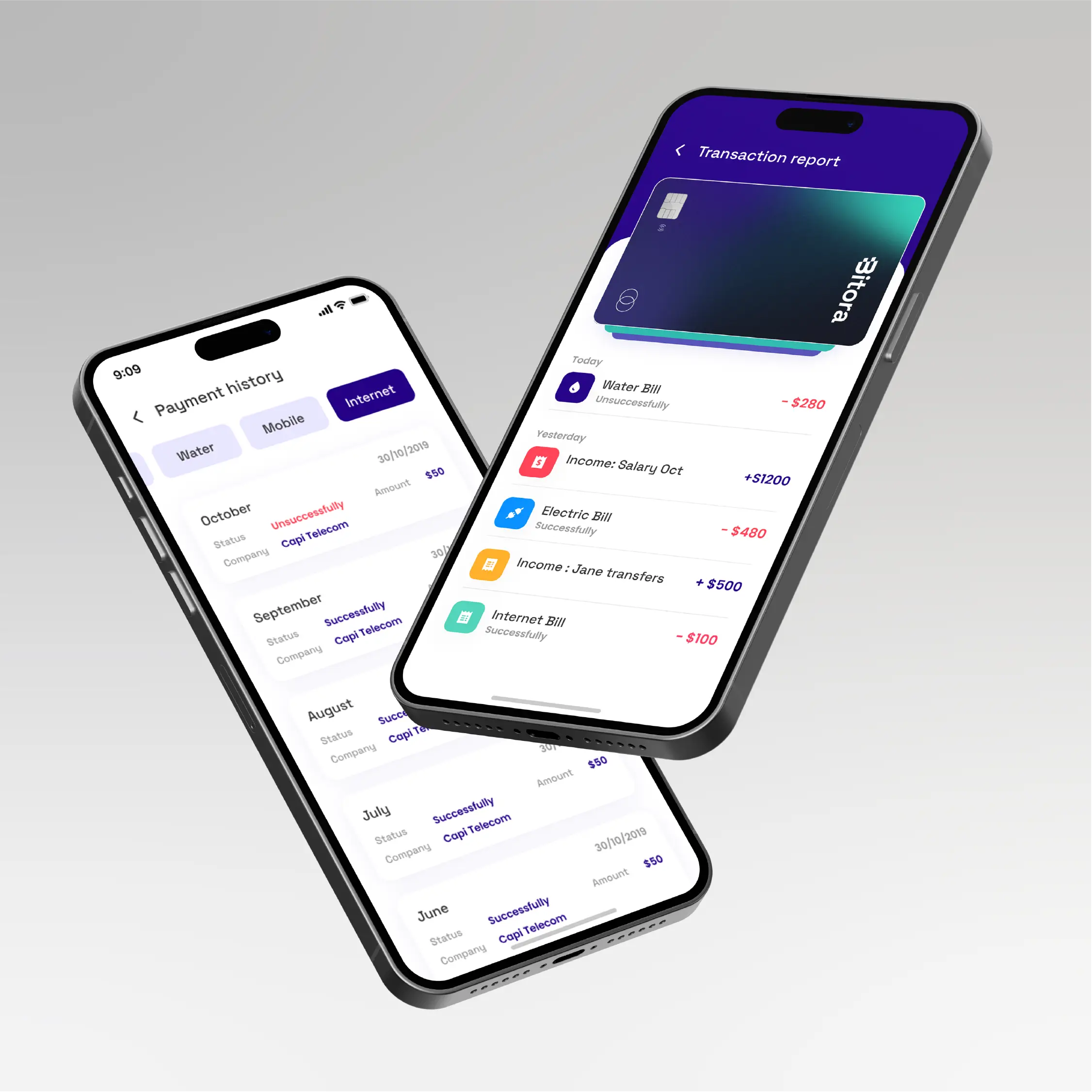
Bitora is a challenger banking app competing in a market where trust is the primary conversion barrier. We rewrote the Framer storefront from the ground up — replacing template copy with conversion-focused messaging, restructuring the information hierarchy, and adding trust signals at every stage of the scroll. The focus throughout was a single problem: getting a sceptical visitor to hand over their financial accounts to a brand they've never heard of.
UI/UX
CRO
Service

Blue announcement bar
A slim bar above the hero carries three pieces of information a first-time visitor needs before they'll engage with anything else: regulatory status, deposit protection, and encryption standard. Placing it above the fold means every visitor reads it before the headline — not after they've already formed a sceptical impression. For a fintech brand with no existing recognition, this framing does significant trust work in a single line.
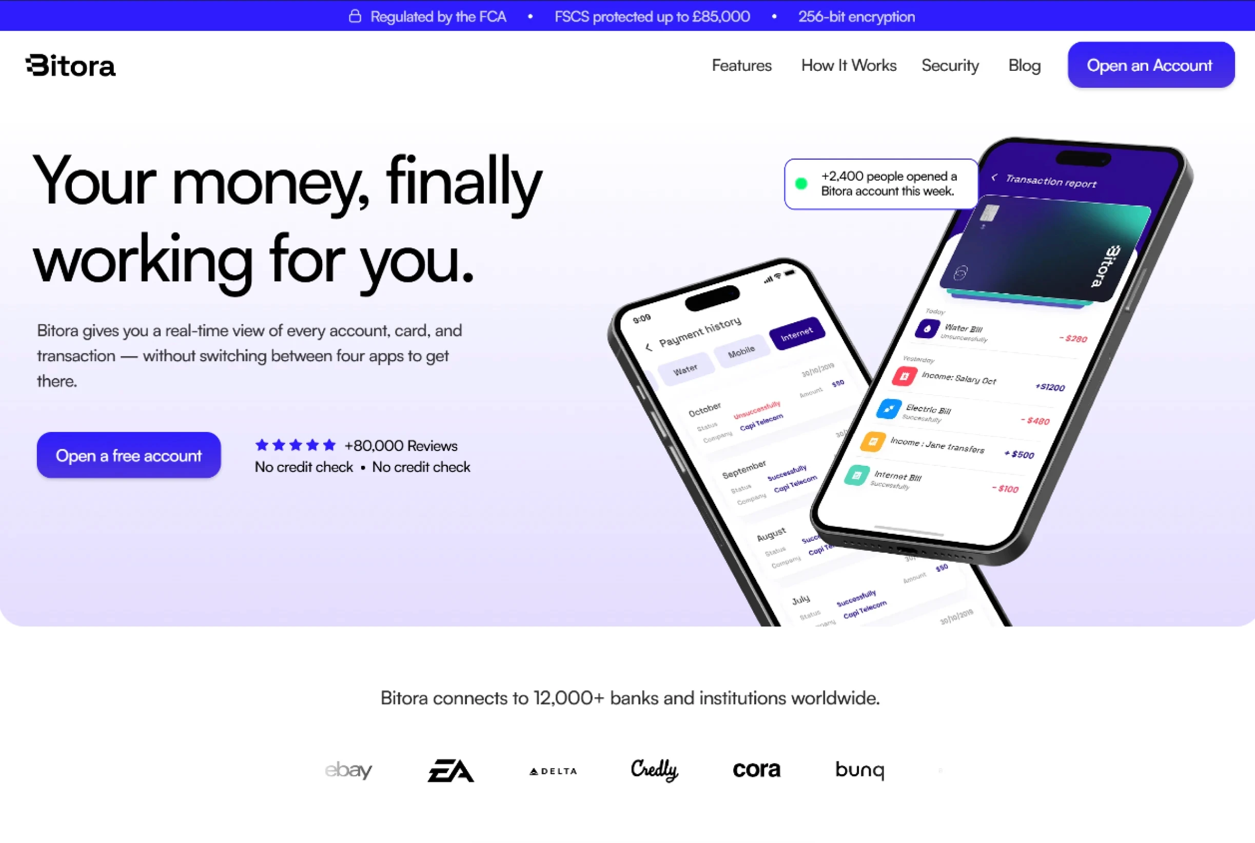
"Open a free account" CTA
The original CTA across every section read "Get Started" — generic, low-commitment language that tells a visitor nothing about what happens next. Replacing it with "Open a free account" does two things: it removes ambiguity about the action and surfaces the word "free" at the exact moment a visitor is deciding whether to engage. Small change, measurable difference in click-through intent.
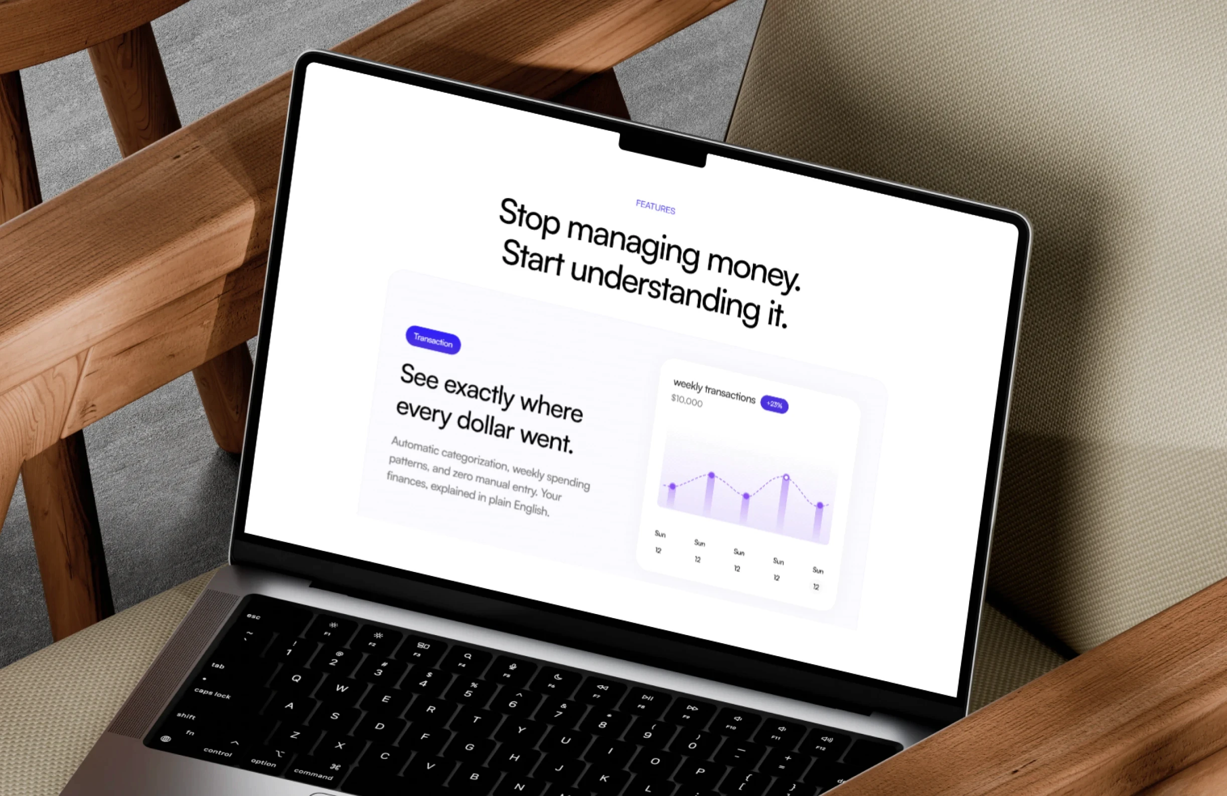
Security copywriting
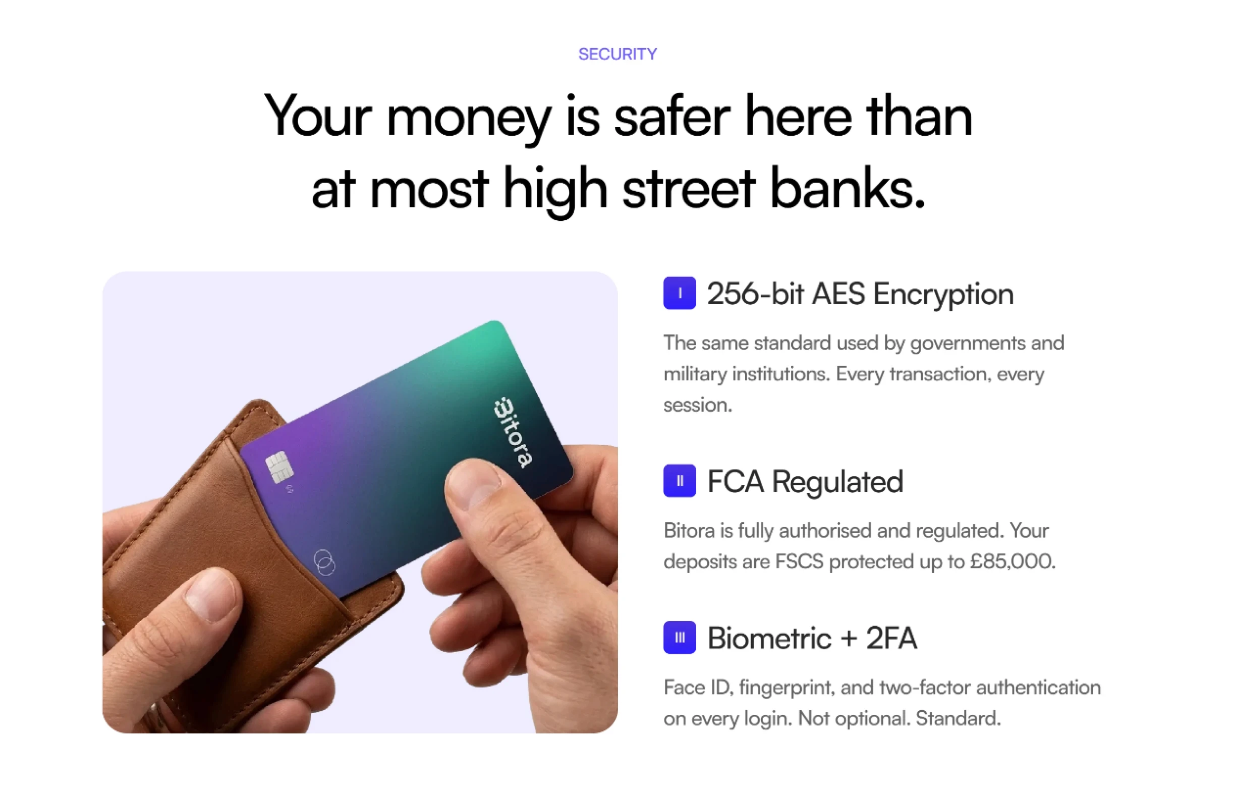
Financial products lose conversions to a single objection more than any other: "is my money safe here?" Most challenger apps bury the answer in a footer or a dedicated security page nobody visits. We gave security its own section mid-page — written in plain language, not legal copy — covering encryption standard, regulatory authorisation, and FSCS protection. Addressing the objection directly and early removes the hesitation that would otherwise follow a visitor all the way to the checkout drop-off.
Integrations section
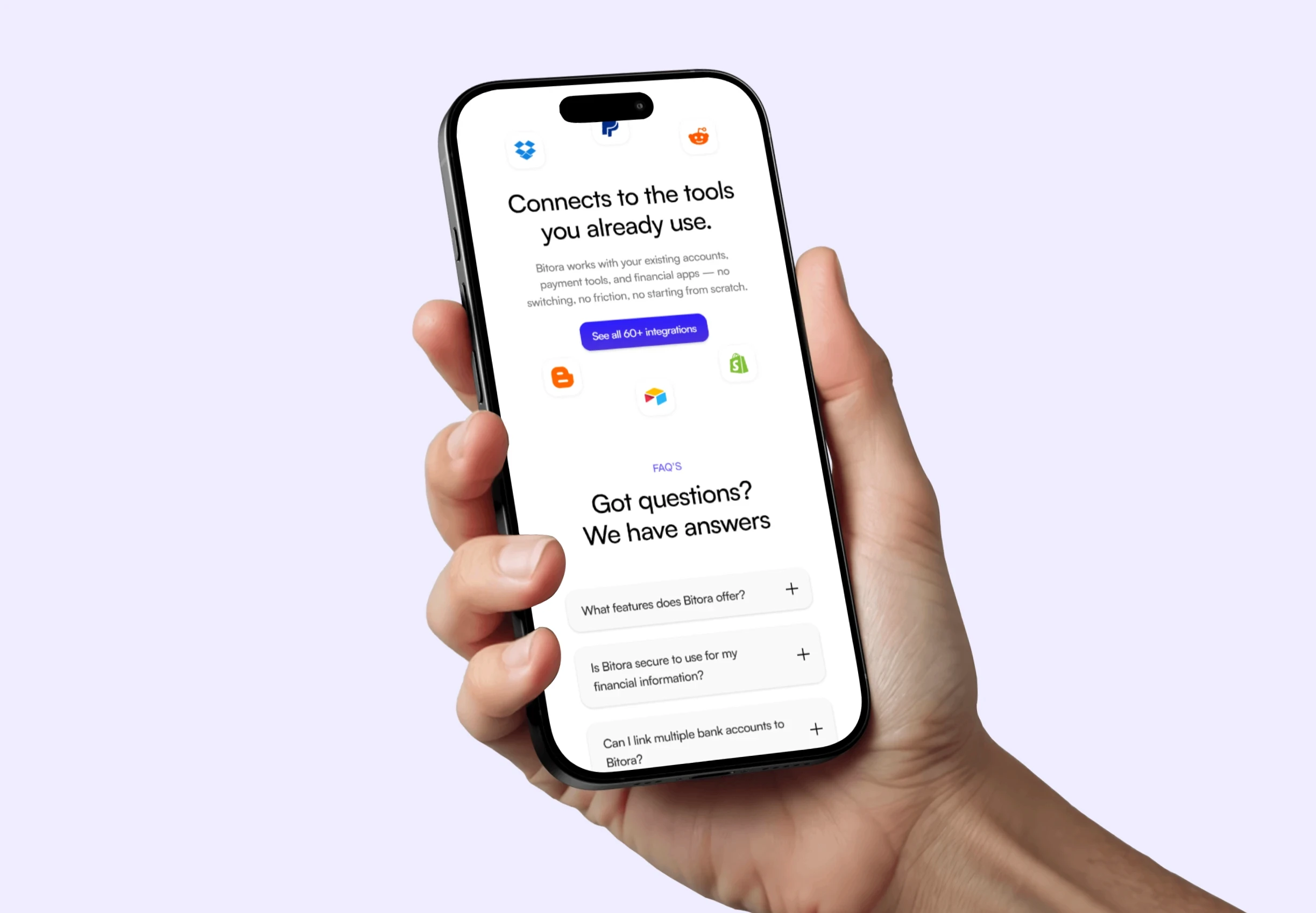
The integrations section reframes Bitora from a standalone app into something that slots into a financial life the visitor already has. Rather than asking someone to switch entirely, it shows compatibility with what they're already using — reducing the perceived effort of adoption. The copy was rewritten to remove the template placeholder text and speak directly to the friction of switching: "no starting from scratch, no data entry, no friction."
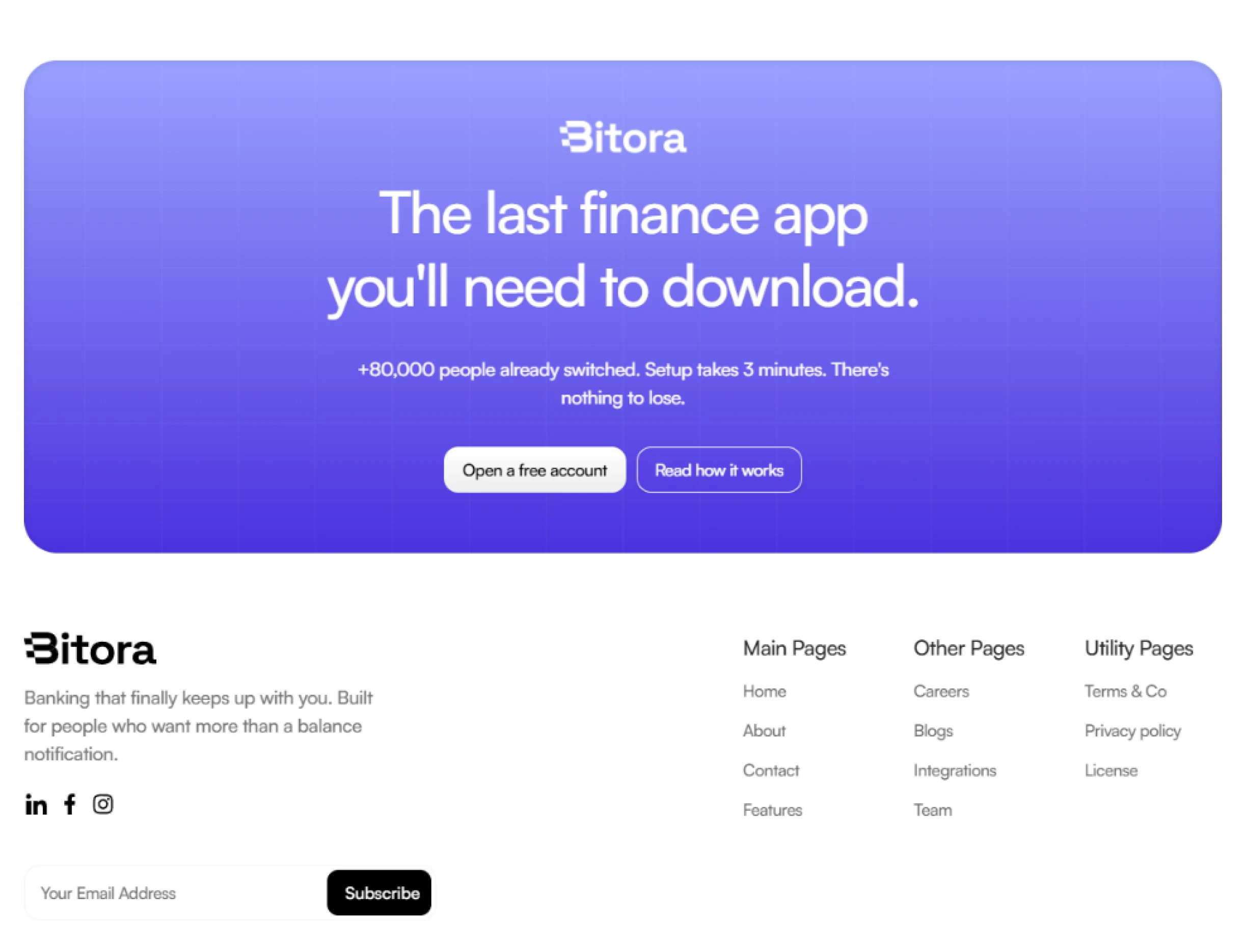
Final CTA section
The closing section was rebuilt around a single dominant CTA with no competing links. The heading sets stakes, the subline provides the final social proof number and a time commitment, and the supporting line below the button handles the last remaining objections — cost, risk, and effort — in one sentence. Nothing on the section exists except to get the click.